Customer Journey
Internal research aimed at increasing conversion showed the biggest fallout points throughout Powerley’s customer journey were occurring primarily due to users navigating the app looking for a specific feature(s) that they were unable to find. This caused them to disengage and never return, though, most of the sought-after features did exist in the experience.
After being deprioritized for a while, it was clear that Powerley’s best opportunities for long-term, sustainable growth would come from improving the customer journey holistically—from login & onboarding, all the way to upsells & subscriptions.
Problem
Users who download the app are not logging in
Not retaining Day 1 users
Users are not upgrading their plan
Hypothesis
Users confuse this app with existing utility apps
Users find limited engaging features in the Basic experience
Users don't understand the value of the app or Energy Bridge hub, therefore can’t justify the cost of upgrading
Users are confused by the differences between plans
Users are unaware of the free trial
Lack of support
Goals
Us: Increase engagement, retention, and conversion
User: Better able to understand the capabilities of the platform and begin their app experience
Utility: Increased number of users on the Premium experience within the utility territory
Success Metrics
Upgrade/Energy Bridge hub request rate
Monthly churn rate
My roles
User Research
Competitive analysis
Product Design
UX/UI
Cross-functional teams
Product Mgmt
Data Science
Data Intelligence
Voice of the Customer
Engineering (Mobile & Web)
Marketing
QA
Challenges
There were several challenges with this project. Historically, many teams focused on small, iterative projects working towards the same end goal, but there was little incentive to rebuild the journey holistically. This lead to disarray in the app and, end-to-end, the scope to correct these issues was pretty significant—we didn’t have the bandwidth to properly achieve our vision in the short-term. We we’re also under a tight time constraint imposed by one of our largest commercial customers, which didn’t leave room for the proper amount of user testing pre-launch.
Approach
This redesign was part of a company-wide initiative to drop everything on the roadmap and work together in attempt to seriously increase conversion in just a few quick sprints. During this time, we were able to borrow top talent from across the company to work on solving problems and rebuilding this journey from the ground up. Though we knew that this flow could grow to be something much larger, we focused on creating an MVP that met the core needs due to time limitations.
Internal Research
After looking at current fallout point data and user reviews, we were able to identify the steps in the process where users fell off, not leading to our end goal of conversions. The key pain points were:
No Entry of Pathway to Plan Mgmt
No Action in the Plan Mgmt Pathway
Do Not Select ‘Free Trial’
Do Not Confirm Subscription
Do Not Submit Energy Bridge request
Discovery
After doing some market research, we found that (according to Invision) 77% of users abandon an app within the first three to seven days of downloading it and most app users only open less than a handful of apps regularly, so the first impressions of value will significantly boost retention. This allowed us to justify our need to add a form of value propositions into our Day 1 flow, pre and post log-in.
We conducted a competitive analysis and compiled relevant information from case studies including Invision, Duolingo, Curology, Basecamp and Instagram to find reoccurring themes such as succinct messaging (detailed info comes later on), encouraging empty states, simultaneous onboarding emails, demo sans logging in, personalized microcopy, large CTAs, conversational copy, guided tooltips, social proof, and intuitive surveys meant to bring the attention to the customer make new users feel like the company genuinely cares about their success.
Ideation
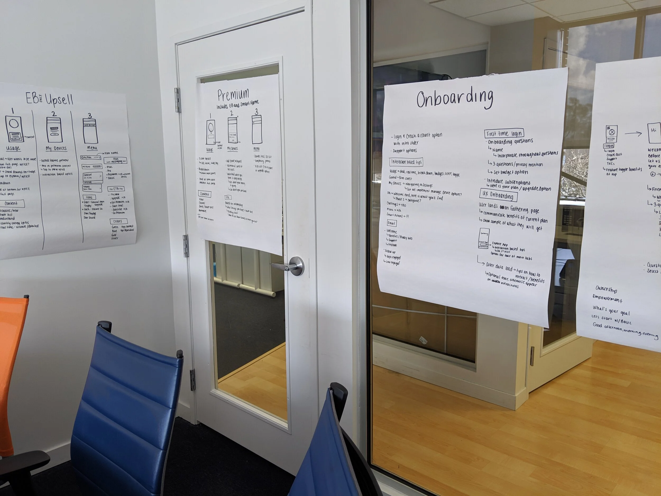
We brainstormed, created user-flows, customer journey maps, and lots of wireframing, prototyping, and iterating mock ups.
Testing
In the short amount of time we had, extensive testing wasn’t on the table, but we did manage to squeak out a Voice of the Customer survey, and several small A/B tests.
Solutions
Value Proposition Intro
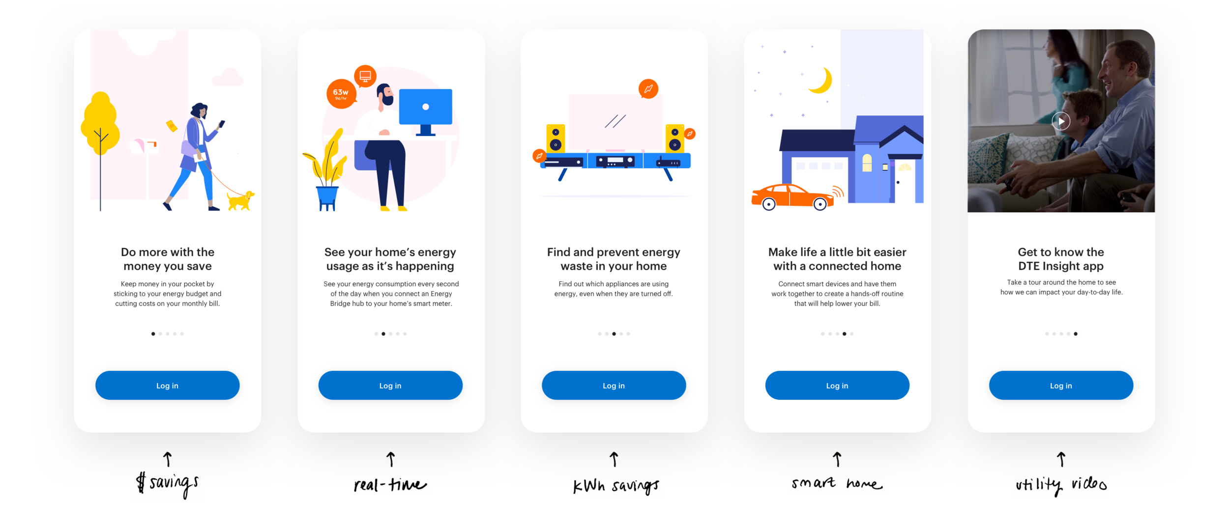
To increase new user engagement and retention, we added a set of value props to communicate benefits of the app prior to logging in. This addition also immediately sheds light on the ability to upgrade, and displays clear differentiators between our app and any existing utility apps (both utility-branded, so customers were confusing the two). These props align with marketing messaging and reflect Voice of the Customer insights.
Login Enhancements
To accomplish successful authentication and decrease pre-login churn, we made several small enhancements to the app login page, such as:
Updating hint copy in form fills to reflect more relevant information (i.e. letting the user know to log in with their existing utility credentials)
Bring more visibility to support links
Tag all CTAs on the backend to properly gather data
Onboarding Survey
The addition of an Onboarding survey allows users to naturally navigate the experience while providing new information. This survey not only allows us to collect important information, but is a great customer service tactic. A range of questions are fun (if done well) and brings the user closer to an 'aha!' moment, by showing them what the app is capable of for them. This level of personalization will increase user engagement and retention by ensuring their best interest is in mind.
Onboarding email Campaign
As part of implementation, new users will automatically receive on-boarding emails introducing them to app benefits and all of the features it has to offer, as well as workflows for new Energy Bridge requests.
Help Center
In order to bring awareness to our (at times complex) features, we created a Help Center that includes many detailed articles. Making support more accessible throughout the app provides an avenue for customers to answer questions and discover feature value and functionality on their own.
See the Powerley Help Center case study →
Advisor Enhancements
Using the Advisor feed as a channel to new direct users to the Help Center displays ease of learning about the app. User’s onboarding survey responses are sprinkled throughout the experience in microcopy, and the advisory insights they’ll see are based on personas they’ve chosen to identify with. This creates sustained engagement and a better utilized platform.
Subscriptions
Our most dramatic improvement simplified the upgrade process, better answered the ‘Whys’ of the Energy Bridge hub, provided subtle plan upsells in practical places, and offered a respectful cancelation process, also intended to minimize churn.
Overall this approach allowed for users to upgrade with limited friction and got more Energy Bridge hubs in the field.
Results
So far, this product was only deployed on iOS at one utility. After one month, request rates increased by 25%, which represents a large expected net impact in Hardware/Software revenue over the period of one year from this utility alone.
In addition, iOS had been traditionally lower-performing than Android with respect to conversion rates. Of the 73 weeks from January 2019 to May 2020 (just before launch), iOS only led in request rates 27% of the time, with only one instance of two consecutive weeks. Post-launch, iOS has had a higher request rate than Android for all 4 weeks.
By the end of this initiative, our team had made wide-sweeping changes that united multiple areas of the app with one common goal. Our accomplishments demonstrated that all-hands-in initiatives could be successful and would be supported by executives.
Onboarding findings also helped reframe the conversation around user motivation.
Next steps
Due to a limited timeline, all of our efforts launched as MVP products. Phase 2 will consist of:
Roll to Android. The impact to iOS is evidence that the new customer journey has an improvement on conversions and although the population of Android users is less, the total net impact to Android over one year can be expected to be more than that of iOS, justifying the effort.
Add a demo version of the app to the to Value Propositions Intro flow. This allows users to experience the apps’s features prior to logging in so they’re aware of differences between multiple utility apps.
Ideally, we’d work with utilities to combine our app with their existing app(s) to create a solution that offers everything in one place to limit customer confusion. This would eliminate the need for a demo version.
Add social proof to the Value Propositions Intro flow.
Create a more robust Onboarding survey, allowing us to gather more information while providing the user with further app capabilities.
Ideally, a guided tooltip flow to explain all features would replace our in-the-meantime solutions.
Broaden Advisor and use it as the app landing page. This would allow for us to create an extensive dashboard of personalized insights and data in a less complex view than our current app-landing, creating a better first impression.


